Financial Report Dashboard (Guided Project)
 still image
Project Purpose
This project aimed to create an interactive financial dashboard to provide stakeholders with a clear and concise overview of key performance indicators (KPIs) and financial trends. The dashboard focuses on visualizing revenue, profit, and other relevant metrics across different segments and time periods.
Key Features & Insights:
- Interactive Filtering: year (2023, 2024) and Market Segments (ie Midmarket, Small Businesses, etc) to analyze specific performance aspects.
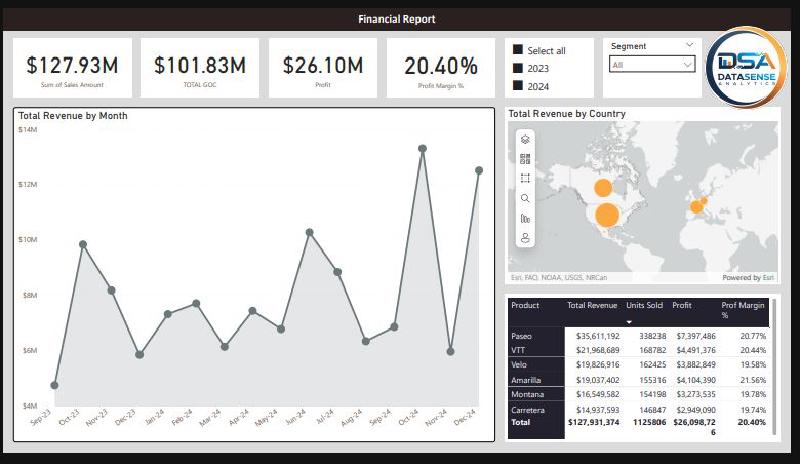
- Key Metrics at a Glance: The dashboard prominently displays key metrics such as Total Sales Amount, Total SOC, Profit, and Profit Margin for quick comprehension.
- Trend Analysis: A line chart visualizes Total Revenue by Month, allowing stakeholders to identify seasonal trends and growth patterns.
- Detailed Breakdown: A data table provides a granular view of revenue, units sold, profit, and profit margin for each product, enabling in-depth analysis.
Process
- Data Acquisition: Data was acquired from Data Sense Analytics.
- Data Preparation: Data was cleaned and transformed using Excel, and PowerQuery in PowerBI to handle missing values and ensure consistency. The data was then loaded into a MySQL database for analysis."
- Dashboard Development (Power BI): The interactive dashboard was developed using Power BI, incorporating charts, maps, tables, and interactive filters to visualize the data effectively.
Tools Used:
Excel, Power BI, Power Query
Key Learnings:
- Gained experience in working with financial data and visualizing KPIs for effective decision-making.
- Improved my skills in data cleaning and transformation using PowerBI.
- Learned how to design interactive dashboards in Power BI to provide stakeholders with actionable insights.