
COVID-19: A Retrospective (Portfolio Project)
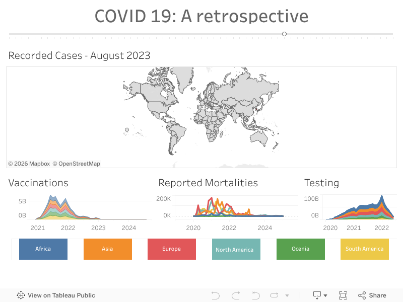
Tableau version
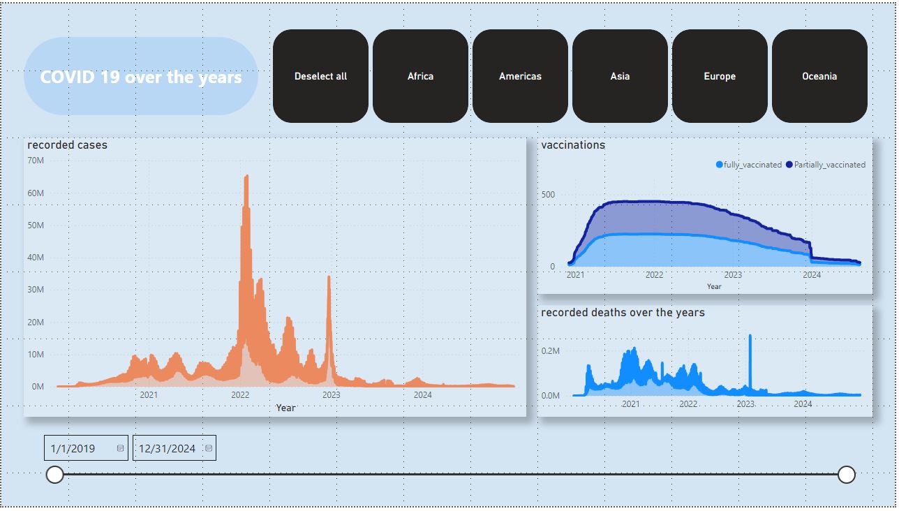
Power BI
Project Purpose
The COVID-19 pandemic presented a unique challenge: how to effectively communicate vast amounts of complex data to a broad audience. This project aimed to address this challenge by creating an interactive dashboard that provides stakeholders with a clear and insightful retrospective of the pandemic’s progression. The dashboard visualizes key pandemic metrics, including recorded cases (acknowledging the data’s modeled nature, which highlighted the importance of understanding data limitations), vaccinations, mortality, and testing data, broken down by continent. A time slider enables users to explore trends over time.
Key Features & Insights:
- Interactive Exploration: Explore pandemic trends over time with an intuitive time slider.
- Global Perspective: Visualize global case distribution on a central map.
- Continental Analysis: Analyze vaccinations, deaths, and testing data by continent.
- Data Transparency: Clear acknowledgment of the data’s modeled nature promotes responsible interpretation.
Process
Data Acquisition:
- COVID-19 data retrieved from the Our World in Data API.
- Countries data sourced from Google and Wikipedia.
- Acquisition Code
Data Exploration (SQL):
- Data loaded into a MySQL database.
- Performed exploratory data analysis (EDA) using SQL queries to identify trends, patterns, and potential data quality issues. This included aggregations, joins, and filtering to understand the data’s structure and identify key insights.
Initial Data Preparation (Python):
- Data cleaning and preprocessing performed using Python based on insights gained from the SQL exploration.
- Processed data saved as Excel files for easier integration with Power BI.
Data Loading (Power BI):
- Excel files loaded into Power BI.
Data Cleaning and Transformation (Power BI):
- Further data cleaning and transformation within Power BI using its data modeling capabilities. This included handling missing values, data type conversions, and creating calculated columns.
Dashboard Development (Power BI & Tableau):
- Visualizations created and designed within the Power BI dashboard, leveraging the insights discovered during the SQL exploration phase. This included charts, graphs, maps, and other interactive elements.
My Role & Contributions:
I played a key role in this project, including:
- Data cleaning and preprocessing using Python, addressing inconsistencies and missing values to ensure data quality.
- Developing the data model in Power BI, optimizing it for performance and interactive exploration.
- Designing and implementing the interactive visualizations, including the global case distribution map and continental trend charts.
- Deploying the final dashboard for stakeholder access.
Tools Used: Python, Excel, MySQL, Power BI
Key Learnings:
This project reinforced the importance of data transparency, especially when dealing with modeled or estimated data. I also gained valuable experience in optimizing Power BI dashboards for interactive exploration and performance.